The Challenge: Use the leaves
Zoo collected. I also found this tutorial:
Sizzix Tutorial | Mixed Media Canvas by Vivian Keh and her associated
Blog Post.
Tutorial starts at 5:54, up to then she itemizes the dies she used and cuts the shapes.
The OP
[original poster] used a stretched canvas for this mixed media page so I got it stuck in my head that I needed to use a piece of canvas. You can buy pads of canvas for painting on just like pads of watercolor paper or mixed media paper.
I also decided, for the first time, that I needed to rotate my book to the vertical for this project.
Red Bear did hers differently so I'll be excited to see her take on this challenge!
Here is my layout sketch.
 |
| Layout - sideways |
I did my sketch in watercolor pencils, knowing that they would melt into the paint as I applied it.
I had decided I wanted my door to open, thus the border on the door part of the sketch. I had to plan for the door to be on one side, or the other, of the center of the book. I didn't think the door would stand up well to being folded in half and bending as the book opened or closed.
On the canvas, it looked very bottom heavy, then I remembered that the canvas was smaller than the book itself, so it worked out fine in the end.
I also laid out the paint colors I thought I would be using. My color plan was to start with pale blue in the upper right of the project
[bottom right in the photo above], to pinks to purple to red all along the bottom
[left in photo].
You'll also notice that the bottles of "Dr. Ph. Martin's" colors are concentrated
WATERcolor paint. Yes, I mix acrylic paint and watercolor paint
all the time. I have also used Matte Medium for acrylic paint with just watercolor paint or stamp pad re-inkers to color it! That is one of the perks of being self-taught, I don't know the rules I may be breaking as we play!
I'm also enamoured, lately, with the interference paints of various colors, so that's where some of the shimmer comes from as well as from Iridescent Medium.
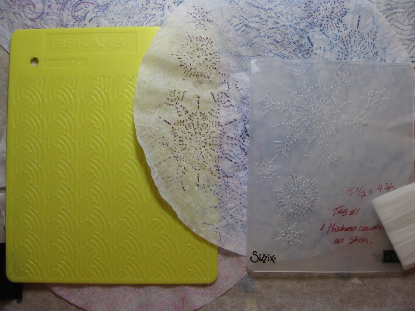
For the snowflakes, I got the bright idea to use my texture plates [and embossing folders
as texture plates] with coffee filters to make the "paper" to cut the snowflakes from.
 |
| Texture plate and Embossing Folders |
I always cut a slit in my coffee filters before coloring them, so they lay flat. Looks cool with the watercolor pencil on the coffee filter. I just put the coffee filter over the texture plate/bump up side of embossing folder and rubbed over it with a watercolor pencil.
I used a combination of Faber-Castell Albrecht Durer watercolor pencil and Inktense watercolor pencil.
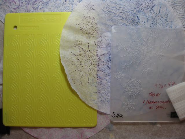 |
| use the embossing folder "bumped up" side and do like a "bark rubbing" |
Then I used a spray bottle to wet the coffee filter. Oh My! These colors turned out a lot darker than I was anticipating! Except the pink one doesn't look like anything at all! I wonder what they'll look like after they're dried?
 |
| Whoa! Those teals are not so subtle! |
Here are some of the flakes cut out and the beginning of a layout plan with the door, leaves, and snowflakes. I thought my die cut flakes were all on the big side so I used a border and corner punch to make some smaller flakes. I also used some of the wax paper flakes that are a by-product of using wax paper to cut intricate die cut shapes.
 |
| Plan A - what goes where? |
Wait a minute! There was no orange in the color plan! Shit happens! When the creativity of the moment calls for a change in plan, plans change! I don't remember why I put orange in there, maybe
Red Bear remembers?
The darker than anticipated color of the coffee filters wasn't so overwhelming once the snowflakes were cut out of them. There were a few drip marks in the paint that I didn't care for, so I used snowflakes and/or leaves to cover them!
 |
| Strategic Snowflake Placement |
OK, I think this is it! Time to start gluing everything down!
 |
| Yes, this is where I want everything! |
 |
| Unless I change my mind! |
As you can see, I changed my mind when it came time to put glue to paper to canvas! I decided to include an intricate die-cut that
Red Bear sent me a while ago and to not use a couple of the larger, darker snowflakes.
I also "cheated" a bit on our challenge in that I didn't limit myself just to the leaves I collected for this particular project. I found some big oak leaves from our yard that I felt were big enough to anchor the project in the bottom left.
The sentiment "The Seasons of Life are Ever Changing" came from
Red Bear.
I dropped a red pen shadow on the leaves.
If you open the last picture in a new tab or window to view it as large as it will go, you may notice and wonder about the horizontal bubble-lines in the red at the bottom. If you zoom in and go to the very bottom right corner. In between the two leaves, you'll notice a mostly orange blob with what looks like little horns coming out of it. hmmm, .... very strange.
I had decided to add an element to the page before this in the book, that needed holes put in the paper. But I had already started this one, ... what to do?
Instead of making a glob of a big knot, I let the threads just be loose, split them, colored them with markers to match the background, and used a blob of GAC to hold them in place. [GAC is Glossy Accent, Clear by Inkadinkado]. After the GAC dried, it looked ridiculous. so I just added dashes of GAC all over the page below where the canvas ended. Then added some paint on top to make them "blend in".
Did I succeed? Did you notice the blobs on your own or did you have to go back and look after I pointed them out? I'm curious to know, leave a comment!
Oh, and,
duh, here's a pic with the door open. Seeing as how I went to the effort to make the door open, I should include a pic!
 |
| A Door Opened |
Done!
~Zoo~
General info/chit-chat about this altered art journal page.
So far, I've deemed every October page to be "leaves" oriented. I don't know how many more times
Red Bear will let me get away with this but ... this time, I had collected some leaves from my sister's house. We were meeting there to plan our mother's funeral and I was outside on a smoke break when I noticed some pretty leaves. I divided my haul and sent half of them to
Red Bear.
During one of my adventures out surfing the interwebs, I discovered the tutorial and blog post. This is the email I sent
Red Bear:
"This is different and totally not what I was expecting to do with our leaves!
We will have to improvise, but I think we'll be able to create our own door with our paper cutter and score boards.
Of course we have a plethora of snowflakes and butterflies to choose from.
Really different "painting" technique! We don't have the type of paints she uses but I already have in mind some of my supplies that I want to use with this. I'm drawing a blank, I can't remember what you have for paint but I'm sure you'll be able to come up with a couple of colors to use.
I'm excited to try this one!
Start the video at 5:34. Up to that point she is just listing the dies she uses and cutting the shapes."
I'm pretty sure
Red Bear suggested we use snowflakes instead of butterflies to symbolize the transition from fall to winter to better match the time of our journal page.
Normally, I would have revelled in creating some hand-bombed lettering but this time I used an alpha stamp set for the large sentiment and just plain-printed my parents names and dates. Maybe my emotions got the better of me, but I just wasn't up to my usual enthusiasm for lettering. I originally printed their names in purple and dates in red, then decided I didn't like it, so traced over them with black. That's where I stopped because things were getting messier rather than better!